Thursday, November 13, 2014

Showing, Teaching, Designing, Knitting. And collecting feathers.

These past couple of weeks have been very illustrative of the process of creation, and how one facet of my life enters another, changing everything in its path. It can get overwhelming when there is a lot happening at the same time, but it makes for a deep, rich creative process.

Showing art:
These days I have been slowing down a bit with both my art creation and shows- just too many things going on.  However, I decided to participate in FAVO's November show. It was lots of fun, and a bit different, as the show went on not just for Friday night, but for Saturday as well. I do have a piece in process that I was hoping to have done for the show, but too many things got in the way, and I ended up just bringing along some older works, along with my "Watercolor Zoo". The weather had turned chilly, and so I decided to bring some pieces that reflected the change of seasons. The works got a lot of attention; most of the patrons had never seen these, and it was fun watching the fascination with the "Winter" woodburning. I thought I should do some more of those.


I did make sure to complete a Yupo froggie, as I have a patron who is sort of collecting my frogs, and was quite upset the past two shows when they were sold out. Luckily, he was there to buy this little guy on Saturday.

Teaching:
I am really excited to be going down to the Osceola Fall Art Festival this coming weekend, as it will be the first time to officially judge a student chalking exhibit for the middle- and high-schoolers. I will also be serving as sort of a 'mentor-as-needed' while working on a square of my own.

Since I was going to be working with chalk pastel at the show, I set up a lesson for one of my private students where we rendered some trees from life with pastel. It reminded me of my year of 'tree portraiture' at Georgia tech that I had mentioned in an earlier post. There were moths fluttering around, trees turning colors, the fountain and pond nearby, the sun sprinkling its shade through the trees, and just a really wonderful time.


Designing:
Recently, I have been in a quandary as to what to do career-wise as things are changing with my family. I will soon have a lot more time on my hands, and I want to put my energy on the best possible track. I absolutely love teaching, but I was not schooled in this avenue and am wondering if it's the best road.

It has been eeking into my head- although I thought it would NEVER happen- to step back into the world of architecture. A big roadblock is that I have been out of the field for 5 years, and the programs used for construction documents are new...If I were to apply for a position, I'd need to invest in some schooling. And then there is the question of whether I would be able to find a postition that suits my creative needs. But yesterday I had the opportunity to work on some concept sketches for a commercial / themed project. So I thought, what the heck, I have nothing to lose, and I was completely floored at what happened. Not only did everything come back to me, but I also felt as if the years I have spent designing in the art field have opened things up in an immeasurable way for me. I was able to sketch out several decent concepts within just a couple of hours, and it truly seemed like not only had I not lost any time at all, I have actually gained a new perspective. I can see a lot of potential for me, if the right opportunity were to come along. So, now another option seems to be opening up, and I have to admit, it's a lil' bit exciting.


And the rest:
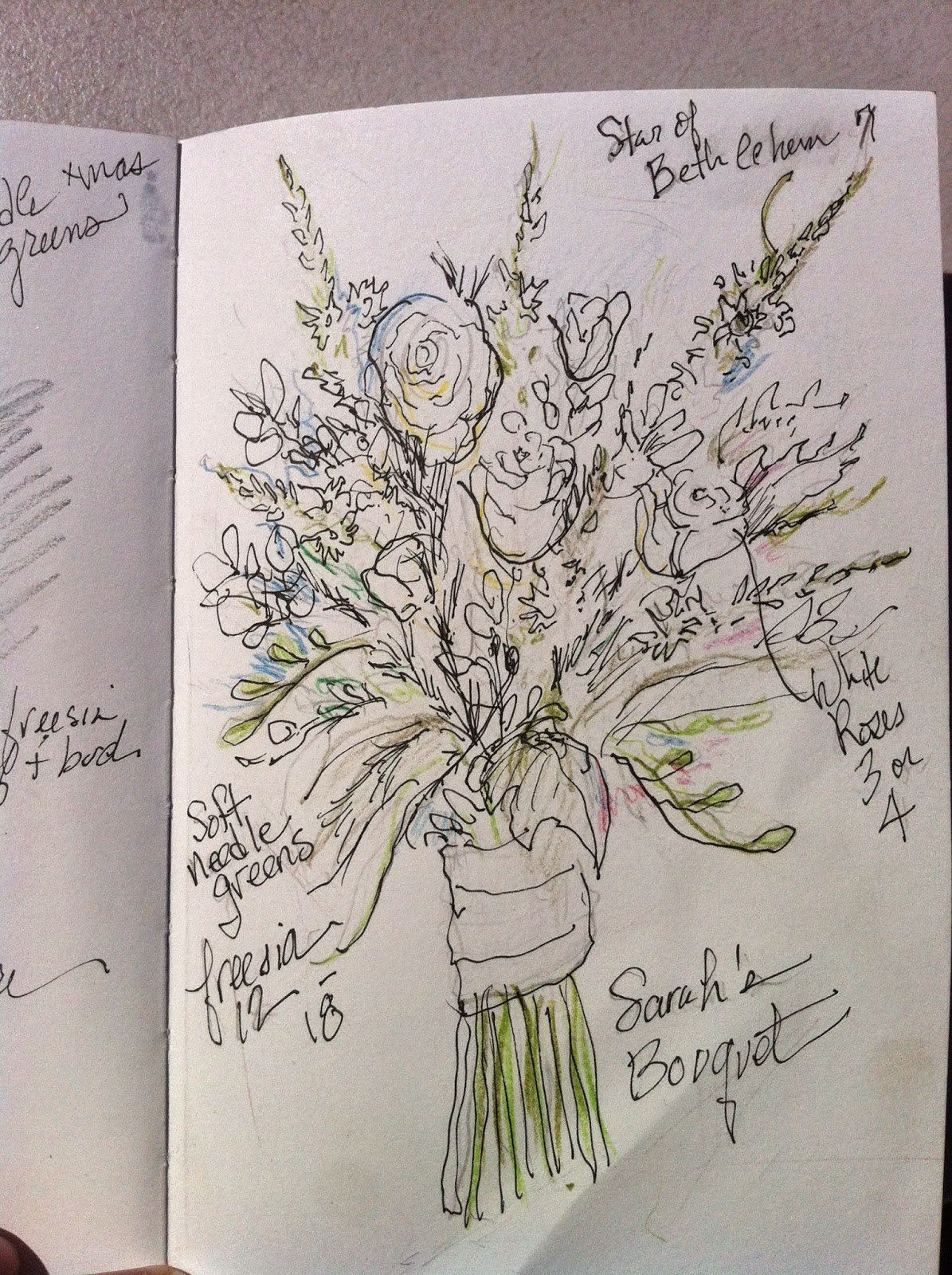
My daughter is getting married officially one month from today and I am also really excited about that! I have been given the honor of designing all of the flower arrangements. This has been, in itself, a story of its own with lots of joy that I hope to share with you in a separate post once it all comes together.


In the meantime, back to knitting again, as I am creating a shawl for myself to wear over my dress for her very-cold-outdoor-reception to be held on a nature preserve in Georgia during December! I have forayed this time into the amazing world of order-online-yarn, and found this incredibly delicious wool made in Peru. I haven't even knitted anything from yarn that wasn't already spun into a ball since I was a little girl, and I forgot how to prepare it! My friend had to help me on that one. By the way, if you are a knitter check out her blog! Frog Monkey


Lastly, I am adding these days to my feather collection. They seem to be everywhere. In my world, they are representative of God's promises. So their appearance these days is very comforting. They have been a great source of inspiration to me, and I hope to share a story soon about that! This picture is of a gorgeous white feather that my student spied hundreds of yards from where we were sitting outside drawing. She tells me it comes from "Queen Bee", the lady duck their family feeds when she comes to visit their pond. :)


Tuesday, October 28, 2014

Mad About Mixed Media: Everything Old Is New Again!

I feel so silly.

For years, I've considered myself a bit of an 'expert' on working with pastels, and now I realize that all the while, I was only working in one dimension with the stuff. And worse yet, the information has been right in front of me all this time, but I haven't had my eyes open!

Well, no more of that.

A while ago, I was doing a bit of research online about the problem of how in the world to keep my chalk pastel works from smearing when finished. Yes, there is fixative, but I seriously hate that it muds up the color and darkens it at the end. What I found out at that point is that while I had only used paper as my base in the past, many artists use board instead of paper, and put on it a base of gesso first; this gives the pastels more "tooth" to stick to,  allowing for less smearing at the end, thus the need for much less fixative. The embarrassing thing is that this is really old news to artists. As in, probably, centuries old.

I then came across a blog by an amazing pastel artist, Sarah Bee, who explained her process. She talked about not only using gesso, but also laying in a base of acrylic underpainting before the pastels. Then I found more information from many more artists about this, and also that I could even work with the pastels with a wet paintbrush!  It was getting more and more interesting!

As I was doing this research, I was struck by a photo on a friend's website with which I resonated so much. It seemed to just capture the essence of this particular autumn for me. The gorgeous photo was taken of the Gapstow Bridge in New York City. Somehow when I saw it I felt like I was there, and I could see, feel and hear the scene. It was one of those moments I mentioned earlier in this blog in which I just needed to capture it. It would be the subject of this first experimentation.

I had some hot-press watercolor board by Canson that I decided to use. First step was to sketch in the scene, and then layer over with some clear-drying gesso.  This was explained in the blog I read, and so I knew what to do. The board I was using was fabulous, because it curved downward just a bit on purpose, so that when the wet media dried, it was flat. If I ever do this again with just plain old mat board, I will take the advice of some of this research, and paint both sides to prevent curling.


What happened next was a complete experiment, so I'll just explain my thought process and the results.

Next, I blocked in the scene with acrylic paint. I didn't worry at all about perfection. I focused on what inspired me about the subject and went crazy slapping down the color. This layer would mostly be just to back up and bring out what happened on top of it. The sky and water were at this point most important to me, since I felt here the wetness of the paint was most important. I didn't really know how the pastels would work at this point, and I needed that liquidity to come through. The sky needed to show through the leaves of the trees. For the bridge, I thought about the cement color between all the gorgeous stones. For the water, I tried to do a bit of blocking in what was reflected.


After that dried, next step was laying in the pastel. The good news was that it had that "tooth" to grip to, as described earlier. The bad news was that it had that "tooth" to grip to...What I mean by that is, the tooth was great because it would not require as much fixative at the end, but it was quite a bit harder to actually blend the pastel colors into the base. Of course, if I really scrubbed the pastel enough to get a lot of dust, then it would blend easier. But, it was a little bit of a shocker. While I thought that I could blend the pastel into the acrylic base (i.e., the clouds into the sky) without creating a blue sky with pastels, it was a little bit less seamless. It felt rough, more like when I do sidewalk chalk paintings. However, I was still just experimenting so I decided just to have fun with it. The cool part about it NOT blending as much was how it worked with the trees- I could just simply drag the side of the chalk onto the base and create 'leaves'. That was enormously fun. I created the stones of the bridge in the same way, just a gesture of their roughness, touching down the blending of the beautiful colors of the stones.


Then came the really amazing thing. After laying in the pastel in the water area, I puzzled a bit about how to make it look like 'water'. I've done this in many media. In pastel, it's just a matter of applying color to describe the reflections of the trees and sky or whatever is seen, and rendering all the ripples in terms of those reflections and shadows/highlights. But or course I was used to blending with my fingers. Because of this "tooth", it would require me to lay in a lot of chalk over the underpainting and then really scrubbing hard with my fingers. But I thought I'd try a different approach- since it was water, and I've read that I can get the pastels wet, maybe I'd try using the paintbrush on the chalk! And it worked marvelously! Now, I will say that when I first wet the chalk it darkened it a lot, and I had to wait for it to dry to see what would happen. I also discovered that it was really important not to mud up the color by letting the brush get too saturated with the darker colors. I needed to work light into dark, and rinse the brush a lot. But I was really happy with the possibilities.


 Last step was laying in those grasses and cattails in the foreground. I will say that by then I was getting a bit philosophical about the whole process- Should I make the grasses wet? Are they wet or dry? Well, they ARE in the water. In the end, I laid it all in with pastel, and wet down some of the darker shadows in the green grasses, and left those dry grasses with the cattails dry. But the cattails themselves, I did touch them with the brush just a bit to bring out the amazing color. This foreground was what struck me first about the photo. I just love cattails anyway, and I loved how their color reflected the bridge and the trees beyond.


In the end, what I had read about was true: It really wasn't smearing! I just touched it with a light coat of fixative and it was good to go.

My son told me that it was his favorite piece I had ever made. He said, "You have to make more!" I told him, pointing to a new board on the table, "I plan to!", and he said, "Well then get to it! What are you waiting for!?" What a beautiful thing, to know that I have only just scratched the surface (pardon the pun) of a technique I've been using for years, and also, I have not just an excuse, but an order to keep on painting!

Thanks for reading!


Saturday, August 30, 2014

Flowers, Fish, and Fortune: A Starving Artist's Day of Serendipity

Before I say anything else : most days  my dad is just a sweet memory, and I get some amazing laughs remembering things he said with my sisters from time to time. Once in a while, I miss him and feel pretty sad, but then I hear his voice say, "What the hell are you crying about?! Look around you!"  He used to tell me to look up at the birds when I felt sad, and see how they lived so simply. He was all about staying grateful...

He comes up a lot when speaking about my art here on this blog, logically, because he was my art mentor...Thus the name of the blog itself...

But, today was one of those days when I was just going about my business, doing fine, and BAM! he dropped right in front of me, just to let me know he was right here, always, and more than that, he's going out of his way to help me.

More about that in a bit...
~~~~~~~~~~~~~~~~~~~~~~~~~~~~~~~

About the fish and flowers:

I am designing the flower arrangements/ bouquets for my daughter's wedding, so flowers have been on my mind a lot lately. While researching about which flowers to use, I've learned a lot about their nature, history, and meanings. I got the idea to create a series of paintings based upon the birth flowers of each month. As I told people about this, some didn't even know they had a birth flower. So, I set out to change this, and I decided to let the 12 birth flowers of the year (well actually more, since some months have more than one) inspire me.

As I thought some people might like to purchase these for birthday gifts, I decided to start with the birth flower of September, the month coming, an aster. I also looked up which critters are around (bees, butterflies, etc.) and play around with some of these where/when they are naturally found. So the aster, which is named after its appearance as a 'star', is feeding a bee.


At the same time, my husband is always bothering me to paint what has worked financially in the past. I know I did a lot of animals, and everyone loves those and wants more. Since I love animals too, that will probably not stop. But specifically, there was a bit of a fight over a goldfish I painted recently, and my husband is telling me,  "Don't paint flowers- you need to paint lots and lots of goldfish." I am always saying I can't just make things to sell them; they have to be inspired by something other than profit. However I decided, just to make him happy, to paint a fish simultaneous with the creation of the aster flower, and the fish sold as soon as I had finished it.

Ok, so I guess he gets a point...But it wasn't a goldfish. And plus, the aster has a possible bid on it too...just saying.


But, I decided, if it works, why not- So, here I go- I am hoping to complete within the next couple of weeks, 12 flowers, and 12 fish, side by side...This system is actually very productive, because I paint the background of one and while that's drying, the background of the other, then back and forth...So it's a flippery flowery fishy frenzy on my desk.


~~~~~~~~~~~~~~~~~~~~~~~~~~~~~~~~~~~~~~~~~~~
Back to my day, and my dad:

My dad was an unbelievable oil painter. My training in paint came from that medium, and I find it to be so comfortable. I don't know if it's the gorgeous forgiveness of the medium or the smell of linseed oil which reminds me of being near Dad painting, but I love to do it. It is a bit of a mess, and can take some patience. But, in my opinion, even though acrylic has all kinds of modern conveniences, oils still beat acrylic by 100 miles. To be completely honest, part of the reason I haven't continued with the big canvas acrylics is that the medium just doesn't compare to me.

Probably one of the most happy times in my life was when I went shopping for art supplies with Dad. He was like a kid in a candy store. If we already had it, it didn't matter, we could always use more. He spared no expense on those trips, and we always left with a huge shopping cart piled high with supplies. I even have some of his tubes of paints left, though he passed over 25 years ago. This morning as I painted my watercolor flowers and fish indoors, I remembered seeing some small canvases in my studio and in my mind toyed with the idea of doing some plein-air oils, which I love to do, in the fall when it's cooler.

I took a break from yupo painting today to go over to the Salvation Army to look for a dress for my daughter's wedding. No luck. But as I putted around, I found a nice frame selling for only a dollar that I thought would be beautiful with my October marigold. At the same time, I saw a frame that I thought might work for the November chrysanthemum, my Daughter and Dad's flower. It was $2.99, and I debated about it, but decided against it, and left with only the dollar frame. In the parking lot, I had a change of heart and went back in to get the frame. "It's only $2.99, I thought, best to get it now, while you can."

So I went back in. The frame was gone. But instead, I saw an art bin that had a sticker for $4.99. I thought it was just the bin. Then I opened it up...

In my estimation, these never-used oil painting supplies are probably worth around $250.


Yup Dad, I get the picture. On to plein-air in the fall. And thanks for the present. :)


Friday, August 22, 2014

The Timeless Beauty of Rendering in Pen & Ink

As most of you who have been reading this blog know by now, I don't always do what I set out to do in the order I plan to do it. This is most assuredly true of every artist.

I felt compelled to tell you that since I am following up with the recent posts about all the intuitive painting I am hoping to do, and the slippery yupo paintings, and the running together of the colors, and it all gets really exciting and fun and then, life happens, (or death happens, as was the case of that beautiful little marigold), and then for a while I just can't think that way anymore and I am faced with whether to do laundry or to sit and be depressed, so what do I do?

I start playing Vivaldi.

And I start drawing things in pen & ink.

A long time ago, (and I think I mentioned it somewhere in this blog), my dad taught me to draw, and would take me to boat docks, and we'd draw the complicated ships with all of those lines and masts and I was not to use an eraser. In fact he taught me never to use an eraser. This is a pretty drastic thing to tell a kid. Believe me, I have tried to teach this to my young students, and most of them start to cry.
I honestly don't remember when he took the pencil away and gave me a pen....but that, of course, is another step in bravery and confidence, that every child, (and even more so, every adult), really should take once in a while. 

(artwork by Charles Geotis)

The important thing to remember is, as with any medium, you ALWAYS start as light as you can, and then work darker. By the time your drawing is done, those first fluid suggestive lines are not noticeable anymore, and in fact, may even help to add some life to the finished piece. I'm not suggesting that this is going to happen automatically, but with practice, and with NEVER using an eraser, it does work over time. And the wonderful thing is that once you get the hang of it with pencil, pen and ink does not feel so scary, and you already have a leg up on what is going on.

What is pen & ink anyway? I think it is kind of funny that we still use that terminology, since it implies that we are using a dip pen and a well of ink. While I liked to work that way as a teenager, (they DID have regular pens then, I'm not THAT old, but I was a bit of a purist) there existed at that time a few other options. My dad used to use just a regular old felt-tip or ballpoint pen a lot of times.

When I got to college, one of the items on our supply list was a cartridge-filled ink pen for drawing with. It was actually pretty nice- the pen was sort of like a sharp calligraphy pen, and it allowed you to press harder or slant the tip to get different thicknesses of line. It's funny- my first year of architecture school was at Georgia Tech. You would think that this school would be heavily slanted in the technical aspects of architecture. To my delight, I actually found the opposite to be true, at least for their freshman year curriculum.

One of my dearest memories is of two professors who would come to our design studio on Thursdays. Their class was completely art. They were a couple of real characters. Two old guys with long white beards (well, old from my perspective at that time...) smoking their pipes, leaning back with their fretted eyebrows, pensively contemplating each little detail of our work...It would make us so happy when a smile came over their faces in pride and happiness with our work.

Among other things, these two men really taught me some great pen and ink technique. One of our projects was actually doing a portrait of a TREE. We all sat outside for something like four hours with our pen and pad of paper, and had to render a tree, with all of its paculiarities and uniqueness. The technique was to use small, diagonal strokes, (again, light to dark) and to delineate the tree with its bunches of leaves, highlights, shadows, edges, trunk, openings where the branches peek through, etc. It may sound funny but I think I learned more in those four hours than I have learned in many entire classes. I am still teaching my students the techniques, and more than that, I've learned to see every single tree as distinctive, and I innately know how they grow. It was important to know through the years rendering buildings as a design architect, but it is also just a beautiful thing to be able to see. I have rediscovered the beauty of this recently, and I highly recommend it.


These days the technology is so remarkably better that 'pen and ink' really just means 'pen'. Everyone has their favorites, but these days I am really loving the Staedler pigment liners. They come in different thicknesses, and I have found the 0.3 to work really well for heavier line work and the 0.1 for really fine lines.


My education in college expanded to show different ways to render buildings, and once in a while I like to remember it. This is an example of a drawing I completed a few years ago, which shows some of the techniques I learned. Although I worked from a photo with this one, the techniques work just as well on-site. As a matter of fact, on-site work is very valuable in terms of timed site drawings in order to train students, or yourself, how to capture a 'place' or a 'space' within a given amount of time. This drawing is shown to you here so you can see some of the different strokes used to delineate different architectural elements.


 You can see in the enlargement that rendering brick, for instance, is not very precise. In fact, if you try to delineate every detail you will lose all of the life of the drawing. I like to sketch out very faint, BROKEN lines along the horizontal, and then suggest random bricks with diagonal shading, just giving the impression of the material. This general idea also works for stone, stucco (with stippling), etc.


Now having said all that, I am not going to pretend that I don't use an eraser as a professional artist. More often than not I do, especially if I am doing detailed work. I will sometimes block out overall frist lightly with a pencil, then go over and detail with pen and ink, and erase the pencil. Sometimes I will even go further and color- as was the case with the recent childrens' book illustrations.

But sketching with pure pen and ink on a sweet drawing surface, black and white, has such incredible benefits. And doing it over and over again makes you grow in so many ways.

It is very soothing creating a drawing in black and white, with tender, deliberate strokes, not in a rush, and tedium is never an issue. Time is just passing as it should, and beauty is being created, one little stroke at a time, with no eraser at all....this comes from the part of me that loves to embroider, and write, and knit. And maybe even play Vivaldi.


Sunday, December 8, 2013

Back to the Drawing Board

These days I seem to be in a scramble of chalk pastels, family, watercolors, clorox cleaner,  driving, laundry detergent, and violin music.  Odd combo, I know...

I used to think that once my kids were grown I would be able to just sail, but I have determined that the juggling act between family, work, and personal health/growth is like a video game. Just when you feel like you're all that, you are in the next skill level and the bullets are coming a LOT faster and your life is on the line. I have yet to figure out how to stay healthy and get it all done. Missed two art shows this past weekend to ward off illness, but I'm glad I did, as I recovered quickly. (Thanks to my Walgreens pharmacist suggesting megadoses of zinc, only a lingering cough instead of the usual bronchitis.) Hopefully another chance will come at the right time. All I can say is that I hope I'm staying at this skill level for quite awhile and get a lot of practice. Geesh.

The works I have now on my drawing board (other than commissions which I can't share yet) are chalk pastel. I thought I'd talk a bit about the range of process again with this medium, as it really does depend on the subject. This first piece was created from a photo my dad took up in Maine somewhere. I think I might title it "Coming Home", not because it's my home, but because I have been so nostalgic about my hometown in Massachusetts, and really reconnecting these days with family. I want more than anything to visit them. I guess you might say I'm "dreaming of a white Christmas", which was the genesis for this piece.

A new snow fall is so incredibly gorgeous. You can see that in a photo. But unless you have actually experienced it, the divine beauty of how everything turns white, twinkles in the sun, and becomes SO SILENT, except for the squeaking as you walk, you really don't know what I mean. Agreed, I am an idealist and I only lived there as a kid, but I would never turn down winter if it was given to me.

Some of the technique involved in this kind of piece is very similar to oil painting.... Basic, overall shapes and tones were laid down on a paper background that was already a color that would be a good undertone for the colors in the palette. (cool grey) The landscape was laid in with the background colors getting more muted and grey as they got further away.


Then, I used a 'workable fixative' layer to partly fix that bottom layer in, kind of like letting a layer of oil dry, and finally went over it with details and more contrast from the snow, trees, and shadows, especially in the foreground.


The next piece I'm working on is a different animal entirely. In this case, I am working with a very detailed, precise subject. The photo I am working from was one I took in the workshop of Saul Cornell, a wonderful luthier and very precious man who has been a friend and taken care of my instrument and those of my kids and students for years.  For those of you who have never been in a luthier's shop, this video of Saul at work may be delightful to you. I could spend hours in there; it is such a peaceful place of order and passionate focus. I truly admire his patience, grace and care. You will see the small room within his shop where I took the photo below in the video- look for the red walls...

https://growingbolder.com/media/entertainment/music/no-strings-attached-call-saul-630302.html


So, here is the photo I took that I mentioned which I fell in love with, and decided to draw...I think it may be like the time I lost my mind and decided to learn how to play the violin. Because it is going to be a bear...


As you can see, there is a LOT of detail, and really no way around it. But, I'm in the mood to hunker down and get myself into some detail these days, so I've at least got a start. In this case, for the pastel work, I used charcoal pencils to lay out the work rather than going straight to the less-detail-oriented pastels, which I did in the previous piece. Instead of laying in large, toned shapes, this piece needs to be treated more as a drawing would be...I worked with the white charcoal first, loosely and lightly, trying to get the basic proportions down, which wasn't the easiest thing I ever did, both with the fact that I'm working with a violin, and also all of those blasted tools in the background! Then, to further define my lines I went over them with a sepia charcoal pencil. Proportion was important here, and I worked by eye, though as I was doing it I was thinking that using a grid may have actually helped. Suffice it to say I did a lot of closing one eye and extending the arm with the pencil and the thumb...and of course there is a lot more of that to go as I go along.


My next step will be to go ahead and lay in the larger areas of tone, like the red wall, the wood table, and the vice and violin. I will need to go back as I do this and double-check the proportions again with everything. Each of those little tools will get defined little by little, first with a base tone and then highlights and shadows. Finally will come the details.

I am thinking of titling this one "Nel Cuore del Maestro", or "Within the Master's Heart" in Italian. Italian, because everything on violin music is in that language, and the meaning is many-fold, which stems from the literal meaning of the instrument being both within the luthier's 'inner sanctum' or shop, and within his heart , (especially fun with the red walls)...Also metaphorically as the violin as having a spirit, or soul. This is also a reference to "The Red Violin"movie, as I mentioned before in my "Transfiguration" post, and that piece. It also has a meaning to me as the violin relating to a person, and the 'master' relating to the divine master, or God, as he works on us in his shop.

So, wish me luck!

News of note- I am still taking commissions for Christmas presents (paintings, packs of cards, etc.)
Pet portraits are a fun gift! Please email me at Lisa-i@cfl.rr.com or call 407-620-1618 to set something up!


Friday, October 11, 2013

Making the Mati

And, the mati saga continues...

I decided not to think too hard about those glasses I mentioned on the last post- my dad taught me it was always best to just squint your eyes and get the big picture, and get on with things. So I'm not sweating the details. The technique of painting on synthetic surface, as I mentioned earlier,  not only allows being loose, but actually encourages it. Now I'm not saying that my way is the only way, but it works for me to be loose and get out the 'spirit' of what I'm doing first, and then going back in for whatever detail I want. And this particular medium is just allowing me to do that, no questions asked. It is just so sweet...

So on I went. Decided to go with an 11x14 biggish size, and used tube watercolors this time to allow some deeper, thicker paint and layering. I don't have fancy stuff, just the Van Gogh brand and on my palette I put white, cobalt ultramarine blue, ultramarine deep, black, and added viridian to mix in a bit with the cobalt and white to get that super - pure sky aqua color in the 'iris' of the eyes.


 So a bit on the differences and similarities as I see them between painting with watercolors on paper and on synthetic surface:

The similarities:
1. you can get all kinds of awesome effects using water and manipulating the thickness of the paint vs. the water.
2. best to work light to dark
3. If you mix one color on top of another they will run together if wet.
4. um...

The differences:
1. You can pull up any and all 'mistakes' or things you don't like later, so there is no need for masking, or being freakishly OCD about things.
2. It's particularly slippery, and the drying time / blotting up time is quite a bit longer, which can be good or bad. On the one hand, the effects can be pretty cool, and you can manipulate for a lot longer. On the other hand, it may take a while to let one layer dry before you can put another layer on top.
3. Regarding 2 above, it is pretty cool to be able to literally lay a layer on top, like acrylic.

So  what I did here for this doodle painting was to start lightly with the outlines of my eyes. I used a seriously watered-down cobalt blue.  Next I went in with the light blue "irises" - they had to dry completely before I could put those little dark dots in the middle without running. Next step was to darken the outside of the eyes with the deep ultramarine color.


You'll notice I was not worried about perfection. The above painting took about 10 minutes. As I said, I knew I could always rework it later, and it's best to be free.

Later I went in with some of the deep ultramarine (which is the color that surrounds the eyes) mixed with black to show shadows, and I pulled up the dark blue by simply using a damp clean brush to get the highlights, thus achieving the 'glassy' quality -  You can see how much fun it is in this video- :)

http://www.youtube.com/watch?v=HYrjUsWtUJ4

I did rework it later, and in doing so just literally let some 'eyes' run together and create a background so I could get the shape of the cluster of eyes the way I wanted it. The goopy mess was worked beyond what you see here, but I did let it dry on its own a lot to allow the look of running water. I wanted it to look like the eyes were crying in the rain. Then I started splattering a bit of water on the eyes themselves to get some runny qualities around the edges.


It got a bit too messy even for me, so I went back and pulled up some of the runs in the center of the eyes.
All you have to do is wet it down with a brush or a paper towel and simply blot it up. You can see the eye on the lower left - that used to have an 'iris' and 'pupil' per se and I just blotted it to pure white.

Now I'm in the process of working on going in to the piece with a bit more detail in the center areas to give the illusion of a glassy reality in the center part. Thickening the dark areas, pulling up paint to show the translucence of the glass... I plan to let it just kind of 'blur out' as it gets toward the outside.


Oh and by the way- remember how I was talking about weird coincidences last time? Well I was dumping out a basket so I could use it to prop up a lamp and work on this. It was full of everything from hair-styling paraphenalia I never use anymore to photos I had turned over and memories I couldn't bear to give up. Waaaaay at the bottom I found this:


 Some charm that fell off of something I don't even remember....God is either a comedian, or just really really good. Because he gave me the spirit to paint that day.

UPCOMING SHOW

Come out and see me THIS SUNDAY, October 13th at the "Fashion Square Art Fair" , 11 am to 6 pm. at the Orlando Fashion Square Mall. - I have been so blessed to be invited by Boone Fowler and Brian Barnett to participate in this exciting event. See the link below for more details on the event and I hope to see some of you there!

http://www.galleryfreshart.com/fashion-square-art-fair.html

Thursday, October 3, 2013

Do you see what I see?

A new work has been mulling over in my mind for a while, and I think it came from the new watercolor technique I love on synthetic surface. It's kind of funny- I cannot remember another time when it seemed the feeling of the medium itself gave me the idea of the subject matter, rather than me choosing the medium based on the subject matter. It's all topsy-turvy. But nevertheless, this idea is not going away.

My concept is to create a watercolor painting on synthetic surface of a glassy object, since the medium itself looks glassy.

I had done this previous piece of gladiolas, and coincidentally, though it was in process, I went to the Morse Museum and was so inspired by the Tiffany Glass. When the painting was finished it was an unexpected miracle that the flowers, and I think especially the leaves, took on the look of some of the backlit glass that I had seen. I think this must be where the idea of doing a painting of glass itself in that medium originated.


Specifically, what came into my mind for this new piece was the glass talismans that Americans call "evil eyes", in Greece they are "Mati", and they are used in many cultures. For me, the symbol is near and dear because I am Greek. The actual superstition and rites associated with it were never really a part of my family or upbringing, but now they are around whenever I am in a Greek store or restaurant, and of course, they have always been strongly associated with Greece.  Most people don't know that the talismans are meant to be defenses against the "evil eye" coming through other people, intentionally or not, not an evil eye itself.  Other reasons were just that I love the aesthetic of the eye when it is made into a glass piece, and the smooth, gorgeous blues against the white. And also, the idea of "vision" vs. "seeing", is just a timely subject of thought for me personally.


To me, I'm not that superstitious, but weird things happen to me all the time, and I can't really put them off as coincidence, so I try to believe in only the good superstitions. Like eyelash wishes. And ladybugs and things like that..Sometimes I think too much when things happen to me, but I always try to give coincidences a little thought, and consider if the universe is telling me a message. My sons sometimes, and my husband pretty much all the time, make fun of me for making too much of everything. My daughter completely gets it, but she's an artist...I like to think that it's what makes the two of us, and all of us artists, a little unique.

Today at lunch, I decided to sketch out the concept I had for my piece on my napkin, just to get it out, and to get the process started.


I took a picture of the sketch, and thought I would maybe share it in a blog about the process once I had finished the painting....

I was really inspired, completely saw the piece in my head, and was ready to start. I even was really in the mood to stay up really late and paint it. So I got my art table all cleaned off, started gathering my brushes, looked up my reference photos, put down the sketch and my glasses next to my computer, and got ready to start. When I looked over to pick up my glasses, this is what I saw.....


Some things are too good to be true.

I felt compelled to stop where I was and take stock. Do I draw this instead? Will anyone else get the depth of the irony?

I don't know, but I thought what the hell, maybe what it means that instead of waiting to blog about this piece until it's all done and fabulous, I just need to share the journey with you. Maybe the universe is telling me I need the collective conscious of all of you reading this to help me. Because I just don't have the heart to move those glasses to my exceptionally large Greek nose. I think it's time to sleep on it.


Tuesday, September 24, 2013

For the Knitting Friends...

Around this time of year (actually, usually exactly at this time, every year) I get an itch to sew, and/or knit. I think the sewing part comes from the ritualistic sewing of Halloween costumes for my three kids, and the terrific memories that come not only from that holiday, but all the others that are coming up. It's funny, but as a Floridian anything can make it feel like fall is coming- something as simple as a slightly lower slant of light in the afternoon or one percent drop in humidity can get me all giddy with excitement for the coming season, my favorite. I know, pitiful...I was born in New England, and clearly am clinging to any season I can get, however small it may be. It goes from 95 with 85% humidity to 90 with 80% humidity and I run to the fabric store to buy yarn....

Anyhow, that's how it is. Well, and also when a baby is coming. That seems to get to me too. I've made so many smocked baby dresses and baby bubbles and all kinds of baby blankets, for my kids and for friends'. When my third child was about to be born, I had bought all this baby blue yarn thinking I'd knit him booties while I was in labor.... True story... After 2 kids already you would have thought that I'd have learned not to read the "What To Expect When You're Expecting" book  and truly expect that I'd be able to do that. As soon as the IV went in my hand, that plan was down the toilet. And honestly, even without the IV, after about an hour I was in no mood to knit. ...And thinking I'd finish them when he was already born with two other little ones, well, that was just a fantasy. My husband still won't let me live that one down to this day.

So this year, it happened again-kind of suddenly actually, I was watching a show on tv and there was a gorgeous knit blanket with giant wide red and white stripes. I could immediately see something like that here at home. I looked online to see some of the basic guidelines- I had made a blanket before but without a pattern, and it was a smaller, baby blanket. What I couldn't figure out were the colors. Should I do the red and white? Blue and white? Everything seemed like it was turning into sports team colors, and I couldn't choose.

I found an amazing pattern! Not only did it have the big, wide stripes that I wanted, but it had them in all different colors, and the palette was amazing! I thought that would be great- to mix up the blanket colors from cools to warms with a neutral in between. Here is the project for anyone who'd like to do it too:

http://www.purlbee.com/the-purl-bee/2013/1/6/whits-knits-super-easy-lap-blanket.html

I went to the store to find yarn for the project, hoping to find something similar. Decided not to make it out of wool, for a few reasons- mainly because of the washability and expense. I would have had to order the skeins online, and they are much more expensive at $15 each (plus shipping) vs. $3 at my local Joann Fabrics with a 50% off coupon for the yarn I chose. Granted, you only need one skein of each color, and therefore could work one at a time, but I thought acrylic might just be more usable. I chose to buy the Lion Brand "Heartland" yarn since it had the same gauge that the wool yarn in the pattern called for, was a similar weight, and was more than enough yardage in each skein so I could still just use one for each color. We'll see how it holds up-

Speaking of Joann Fabrics, if you have an iphone, there's an app for Joann Fabrics which gives you coupons- and also get on their mailing list to get more! - I started just buying my first two colors and went back and got all the rest within another day with all the coupons I had!

However I will say that the yarns at the Purl Bee (see link) are truly exquisite in color and quality that I can see. Apparently their colors they showed are not always in stock. In my case, the yarn that I chose to use did not come in all of the colors they had shown, so I had to take that into consideration. I was disappointed that there was no "Stratus" which was a sky blue that had 'clouds' on it (But that was also probably a leftover from the baby blanket that this was modeled after, so I let that one go.) also, no hot pink. That was a disappointment. But they had a delicious medium pink that was even better than the Purl Bee's two pinks combined, and I stuck in a red. The lineup I had turned out like this: From left to right I chose "Black Canyon", "Olympic", "Gs Mountains", "Acadia", "Denali", "Redwood" and "Sequoia".
Oh yeah, it's gonna be cool. It probably won't be done for another 10 years, but it will be gorgeous! 

So, I started. My biggest issue was working with circular needles. I've never had to do that before.I think if I were knitting in the round, I would have been ok. I watched all of these videos on how to work flat on circular needles, and it seemed SO EASY. In the videos, they would cast on 10 or so stitches, then knit to the end of the row, and say, "So now, simply turn your work." and they'd switch needles- like you would with straight needles. Well, let me just tell anyone who is doing this for the first time, what they should have said instead was, "So now, YOU BETTER TURN YOUR WORK OR YOU ARE GOING TO SERIOUSLY SCREW UP!!!!"It gets quite confusing when the circular needles are full of yarn and you don't remember - it's pretty tempting to just keep on knitting and you end up knitting in the round. I did that for 2 rows. and then realized what I had done and had to pull the whole thing out. 142 stitches....

Here are some photos of what to do NOT to screw up, just in case it helps anyone out there. I realize this may look obvious, but if I messed up I'm thinking someone else can learn from my mistake.


 So when you reach the end of the row, (above), even though the needles are CONNECTED by the wire, switch the needle that was in your right hand to your left hand (below).


 I know, it looks ridiculously obvious. Trust me, it's easy to mess up! The photo below shows the beginning of the next row, which the pattern calls for a 'slip stitch edge'. So, begin the row as if you are going to knit, but simply slip the first stitch from left needle to right, and continue knitting.


Good news is that I took another look at the finished size after I ripped out those first two rows, and realized I didn't want a "lap blanket", I wanted more of a throw blanket... So the second time I cast on an extra 48 stitches, for an extra foot of width. However, The Purl Bee pattern just calls to use each skein up for a 6" band of color. There is quite a bit more yardage on mine, but I am kind of just hoping that it works out because I haven't actually done the math as to whether the extra yardage on my skeins will be enough to get the 6" bands of color. So, kind of winging it, but I figure if my bands are thinner and I need the blanket longer I'll tack on another color at the end. (Either that, or hope there's still enough yarn in the same dye lot left at the store when I discover where I am after the first color! ) 

So what about all of the other projects I'm doing? Like the ABC children's book, and the pastel work, and the watercolor work, and the oodles of terrific kids I'm teaching? Well, it's fall, and sometimes, you gotta knit when you gotta knit. It'll all get done eventually. Granted, I never finished the booties, but that was 16 years and a lot of learning ago. I think, after almost 25 years of marriage, even my husband is starting to figure out that I do finish what I start, most of the time, even if there's a lot of projects happening at the same time--he even came with me to get all of the yarn at the second trip, which was not a comfortable environment for him (he came out saying he felt like he needed to go to the auto parts store).

Well, I don't know when I'll finish the blanket, but it sure is fun to knit again. And I'm happy to have his vote of confidence. Maybe it's because I've gotten 2 out of our three kids raised and out of the house- 2 points for mom!  Even though he DID just remind me that we still have that baby blue bootie yarn in a bag somewhere!! But who SAYS they're undone!? I'm planning for grandkids! LOL!


Saturday, August 31, 2013

Girl Overboard

“I must say a word about fear. It is life's only true opponent. Only fear can defeat life. It is a clever, treacherous adversary, how well I know. It has no decency, respects no law or convention, shows no mercy. It goes for your weakest spot, which it finds with unnerving ease. It begins in your mind, always ... so you must fight hard to express it. You must fight hard to shine the light of words upon it. Because if you don't, if your fear becomes a wordless darkness that you avoid, perhaps even manage to forget, you open yourself to further attacks of fear because you never truly fought the opponent who defeated you.” ~ Yann Martel, "Life of Pi"

At its basic, this post is about delving into watercolor painting....Now, this is going to sound extremely dramatic for something so mundane as trying a new art medium...this was more than that.
 
I spent a very long time, most of my life, really, sort of playing it safe in terms of my art. I was classically trained, had worked for years at being a master of realism, and the thought of just finishing a piece when it looked "not done", or "out there", was a bit foreign to me. Which is exactly why I forced myself to jump into a sea of complete unconscious experimentation.

It's hard to describe the joy of the freedom of this letting go. It all became a bit heady. But here's the gist of how it went down:

My ship was sinking. Creatively and emotionally, there was a storm brewing and I knew without a doubt that things were going to change. So I had to do something drastic.  I had absolutely nothing left to lose....Since the storm was coming anyway, I decided to jump in.  If I could swim, my life could change forever. If I couldn't, well, at least I died trying. The days following in the lifeboat were some of the strangest and hardest I've endured since my youth, but I didn't have much of a choice. I was still alive, seasick, and it seemed lost in how exactly to proceed to survive.

(Forgive me for all of the 'Life of Pi' references, but this is about watercolors. and animals. so, I am giving myself license. Maybe I'll spare you in the future. Maybe.)

It all started when I happened to see the background picture of a friend's cell phone: she had a photo of her pet cockatiel, "Sunny"  on there, and it seriously brought a smile to my face. I immediately saw it painted in watercolor. Specifically in a kind of water-based paint that would slip and slide on a glossy surface. Almost at the same time I imagined a painting of my rabbit the same way. Something was telling me to go directly to the art store and find this mystery medium that I was inventing in my head!

So off I went. And all I could think of was 'hot press' (smooth) watercolor paper. I couldn't find such a thing. But what I DID find was a pad of "YUPO" paper that was a synthetic surface and seemed to be exactly what I was looking for.

So for the next couple of days, I experimented and it was CRAZY scary but oh, so fun, and I totally enjoyed this new medium. The paint slid and slipped and did absolutely nothing like I expected it to. But I said, well, here goes....

 I originally started some pieces, included the one of Sunny and of the Bunny with a pencil sketch, but after a few paintings realized that was completely unnecessary. The medium is so forgiving and you can completely paint over it, or simply wet down a mark you don't like and pull it up with a napkin. It's hard to describe just how different and FREE the technique is. I felt like a child again.


 The scary part was that I had to allow myself to just be loose, not to worry about making anything look realistic. It was about trying to capture the essence of the subject- of course, that's always what it's about, but in this case it just feels so effortless and easy that it feels like you're doing something wrong. Once I got over that and trusted it, trusted my hand and the water and the paint and the fluidity, and then looked at a painting that was simply FUN and said, "It's done"., my life was just different.

So I dug in deep and found what I wanted to say. It started with the bird, and then I realized that I am really just a kid at heart, and always have been sort of a "Dr. Doolittle" person, ever since I could remember. I got so addicted to creating these little animals. The best part was the smiles on the faces of kids (and adults!)  who resonated with them.

 It was so much fun to just try to ALLOW myself to BE that kid again, and not be afraid of being perfect. It really came to light to me with this elephant, when I just let a really drippy pool of greyish pink paint dry the way it wanted to for his ears, and only very loosely used a slightly dry brush on his wet belly...and voila! elephant wrinkles! Made me feel like it was OK to be imperfect, the elepahant was made with all those crazy wrinkles, he was different from every other elephant, and God himself was probably just making us all with crazy pools of paint and quick brushstrokes anyways, so why stress about perfection?!?!

So here I go, traveling on in the path that the paint, and the brush, and the water take me in this glorious world. Thanks be to God for the chance!


You can find more pics of my YUPO animals on my art website at http://www.ikegamiart.com/#!watercolor-zoo/c1p5n

"You may not believe in life, but I don't believe in death. ... The reason death sticks so closely to life isn't biological necessity--it's envy. Life is so beautiful that death has fallen in love with it, a jealous, possessive love that grabs at what it can. But life leaps over oblivion lightly, losing only a thing or two of no importance, and gloom is but the passing shadow of a cloud.”
~ Yann Martel, "Life of Pi"


Tuesday, August 13, 2013

Full Circle with the Chalk.

Just quick note to restart this blog, and to bring readers up-to-date on where my journey has taken me...This is going to have to be a 'two- step' post.

First, a glimpse at the first piece that poured from my heart and really started my journey in fine art after I had left the 'real world' working as an architect and project designer. The piece is titled "Celli in Waiting", and was drawn from a photo that I took at a dear friend and very talented luthier's shop- Jan Van Rooyen. He lives with his wife in a beautiful home attached to his shop, in a very gorgeous part of Florida not too far from Gainesville, where I went to architecture school. He has titled his property, "The Magic Forest", and I believe aptly so, because every time I am there I feel as if I am entering a time and place that is somehow a magical haven from the noise and darkness of the world. I explained in an earlier post how I came to love the violin, and of course that translates to all stringed instruments, especially the cello, as my son has played from age 4 to now, at age 19, and his playing always turns my heart inside out.

So, for your reference, my first cherished pastel piece. It is interesting that after all this time I have another piece in my mind that is similar in subject to that first one in the same medium.

 "Celli in Waiting"
Chalk Pastel (2008)


And then a recent piece, along with a video, showing how I work with chalk pastel. It seems that I resonate well with this medium, and I cannot truly explain it away. I certainly don't have the most experience using that over other media, although it comes a close second to pencil, and it is used quite a bit like it. And I really and truly love to paint. There just seems to be a beauty about applying the color first, and THEN mixing. It all happens so magically, and the simplicity and immediacy of it allows me so much freedom of QUICK expression. And yes, it's messy, but so is cleaning oil paint off brushes! This piece happened because of my love for theater. Believe it or not, this image comes from a photograph of a stage set, looking up at the wiring and lighting. It has been a dream of mine to combine what I love about architecture, visual art, and performing art, and work with a team to create stage sets. I did get a small taste of this a long time ago, and someday may pursue it again if the opportunity arises. I saw a photo taken by a friend, Aradhana Tiwari, a very talented director and writer in Central Florida, who graciously allowed me to use her photo for inspiration. The drama of the light and the glittering glass was perfect for the medium, and it was a lot of fun to do.

Untitled ~ Chalk Pastel
2013

Click on this link attached to see some of my work on the above piece; in the video I had begun by laying in some of the mid-range hues, and then went over it with highlights first and then shadows. 


 However, interestingly, despite the fact that I was very pleased with the outcome of this latest piece, I have recently sort of jumped overboard and am HAPPILY swimming in a sea of watercolors right now....... Curiouser and curiouser......Stay tuned to find out how, why and WHAT happened when I jumped!